Our favorite color often corresponds to various aspects of our personality. This is why chromotherapy can help us to find or recover our well-being.
According to various statistics, it has emerged that our mood, as well as appetite, blood pressure and certain metabolic functions of our body are influenced by colors. Precisely for this reason, therefore, we should have a special eye both for the colors that surround us and those that make up the foods we eat.
To relax the mind and the thought, there are small tricks, such as painting with colors the rooms of the house in which we live or the place where we spend more time.
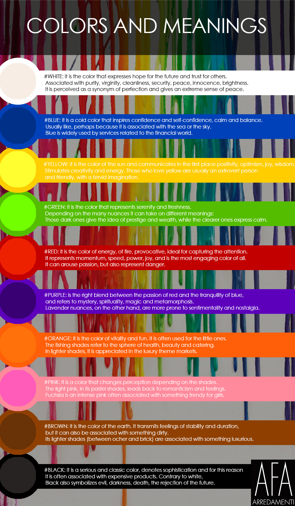
#WHITE: Besides purity, light, the desire to move forward and trust in the future and in the world, it has several benefits. It enlarges the spaces in which it is used and gives the optical illusion of higher ceilings. It remains definitely, together with other light colors, the ideal color for small environments.
#BLUE: this color is said to lower blood pressure and slow the rate of heartbeats and breathing. This is why it is considered a relaxing color and is often recommended for bedrooms and bathrooms. But some contraindications must be taken into account, such as the fact that the blue color can become particularly unpleasant and cold when little natural light enters the room. Blue, it is true, has a calming effect when used as the main color of a room, but only in cases where soft shades are chosen.
#YELLOW: is a perfect color for kitchens, for dining rooms and bathrooms, where colors transmit joy and energy. In rooms or small spaces, yellow makes the rooms welcoming. Although it is a cheerful color, however, it is not a good idea to use it as the main color of a room. In large quantities, yellow tends to create feelings of frustration and anger. In chromotherapy it is believed that this color is able to stimulate the nerves and purify the body.
#GREEN: is considered the best color to relax the eyes. Result of the combination of blue and yellow, green is a color suitable for almost every room in the house. In the kitchen, green cools things, in the living room encourages relaxation, but has enough heat in itself to provide comfort and to stimulate sociality. Green also has a calming effect when used as the main color for decorations. It is thought to relieve stress and to help fertility. This latter detail makes it an ideal choice for the bedroom.
#RED: increases the energy level of a room. It is a good choice when you want to arouse enthusiasm, especially at night. In the living room or in the dining room, red attracts people and stimulates conversation. It also appears to increase blood pressure, heart rate and respiration. It is usually considered a too stimulating color for the bedrooms, but if you are alone in the room at night, in the light of the lamp, the color subsides and becomes rich and elegant. The most intense shades of red make the adrenaline rise like no other color. You must always choose carefully: the crimson tint, for example, can make some people particularly irritable. So surely this color is not to be chosen as the main color of a room.
#PURPLE: it is a rich and sophisticated color. In general, luxury and creativity are attributed to it and, if associated with other nuances, it provides depth to the room. Lighter shades, such as lavender and lilac, give the rooms the same properties as blue, without the danger of looking too cold.
#ORANGE: Orange is a color that gives emotion, enthusiasm and energy. Usually it is not a good idea to use it for a living room, but it remains the main color used for gyms. It allows to release emotions during physical activity and transmits the energy mentioned in the above line.
#PINK: it is a very controversial color, usually chosen by those who love it to madness. Those who refuse it can not stand it at the sight. And even those who love it, often afraid to use it in furnishing. But let us not be fooled by this sharp division of crazy lovers and haters of this color: the rose for psychology expresses sweetness, understanding, delicacy, tranquility. Its strong point is to lighten the mind by removing negative thoughts. This is why it is classified as a positive color.
#BROWN: it is the color of the earth, it is enveloping and transmits stability. It is the ideal color to create warm and elegant modern environments. It goes well with lighter shades such as cappuccino or turtledove, but is also perfect with wood essences. The warmest and most loved shade of brown is the chocolate color, enveloping and with a velvety effect. The chocolate color can be chosen for both the furnishings and the walls. To move the environment, in both cases, it is a good idea to combine it with light colors or with natural wood essences.
#BLACK: Exactly like white, it is an essential color for every decorator. Black is used to accentuate things. As for the ceilings, the black, as well as the other dark colors, gives the effect of resizing, so we will have the feeling of a lowered ceiling. This last thing is not to be seen as a point to the detriment of black, but on the contrary it can be positive because a lower room can increase the sense of intimacy.